Honeywell Le Sucre™
Le Sucre is a compact wireless intruder alarm for self-monitored systems and is ideal for private residences or second homes where no phone line or Internet connection are available. Developed in response to homeowner needs, Le Sucre range is designed to unobtrusively integrate into today’s stylish interiors and then placed anywhere in the home.
Sucre Box is a wireless security and home automation gateway with wireless keypad/TAG reader and wireless sensors, which operate at 868 MHz European frequency. It provides a range of more than 1000 meters open space and integrates an IP / Ethernet module for alarm transmissions and notifications. In addition to IP, Sucre Box+ includes a GPRS module for main or backup transmission.
Sucre Box system includes a wireless visual verification feature which allows you to see what is happening if an alarm is activated. The home owner is notified by SMS or email and can distinguish immediately whether an intrusion has occurred or if it is a false alarm. With the Total Connect Comfort International mobile App, the end-users can monitor their home and family security as well as the Honeywell evohome thermostat system control.
Objective
Objective of this design activities was to create best in class user experience which helps in better brand perception, brand loyalty and minimize the number of calls to tech support.
Design Approach
Pros: Completely revamped workflow, interactions and graphics will result in best in class user experience for better brand perception, brand loyalty and fewer calls to tech support.
Cons: Needs a new development platform like Flex, Silverlight etc.
Pros: Zero programming effort.
Cons: Little improvement in user experience as it involves replacing the existing graphics like the top banner, buttons etc and not the existing workflow and interactions.
How we did it (Approach 1)
Experience of using a product starts from opening the box.
Always guide the user on what to do next.
Never ever confuse the user.
Use Readable fonts everywhere.
Simplify the process: Don’t ask for user input where not required.
Aesthetic & Minimalist design.
Use of Animations to guide the user to next step.
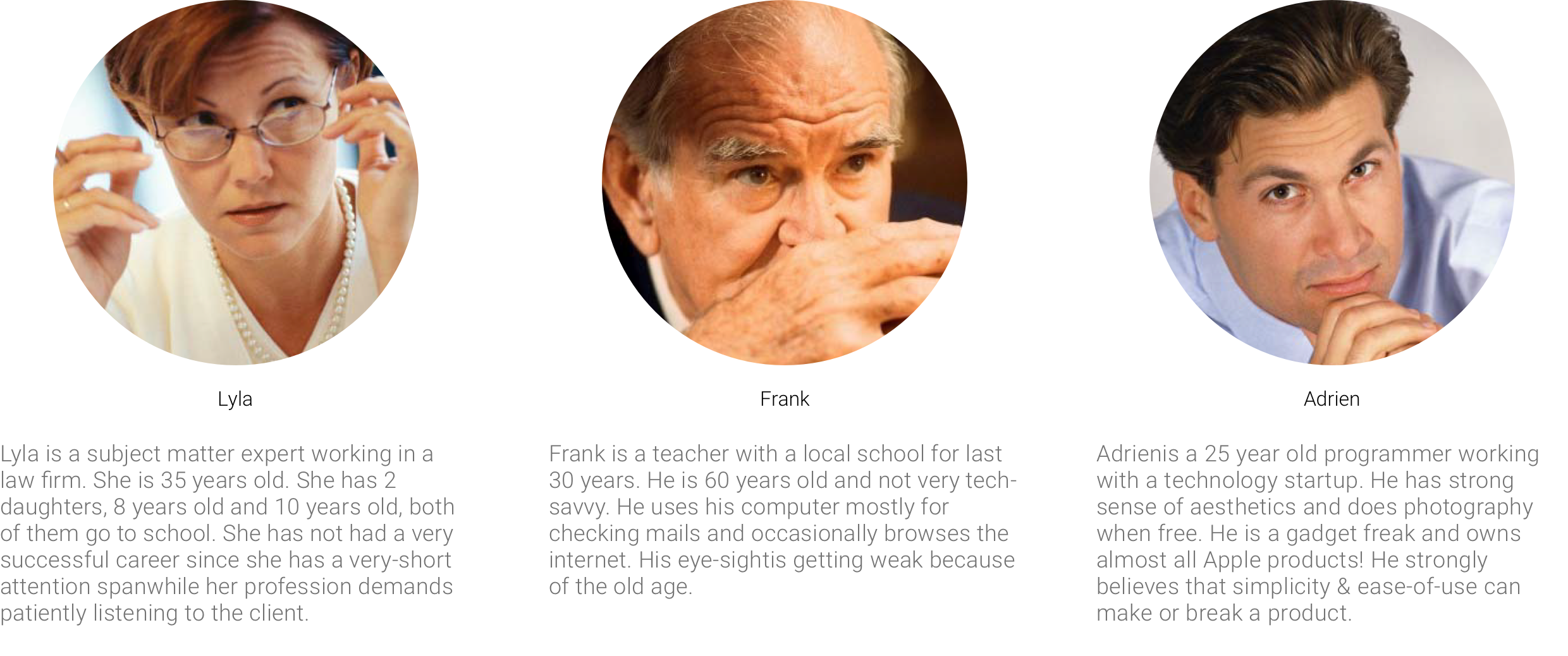
User Personas
Task Analysis
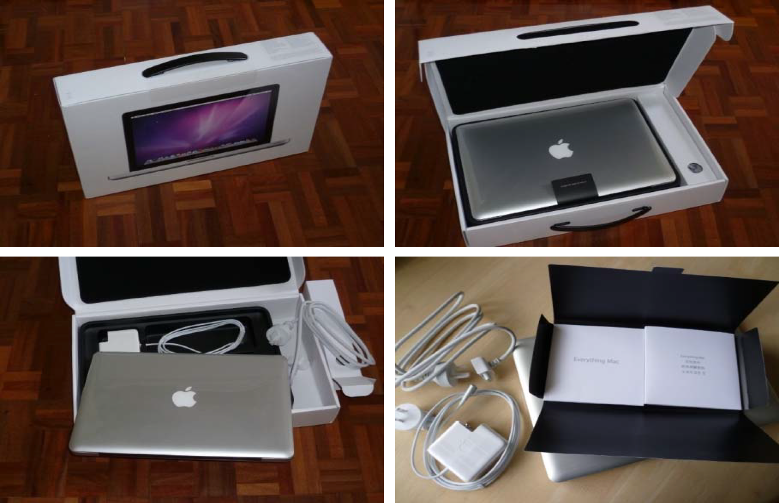
User Experience starts from opening the box!
A. Simple, effective, strong and efficient packaging.
B. The documentation comes in a small black satchel, in contrast with the rest of the white packaging.
C. The manual booklet is easy to read and starts with a welcome message: Congratulations, you and your MacBookPro were made for each other.
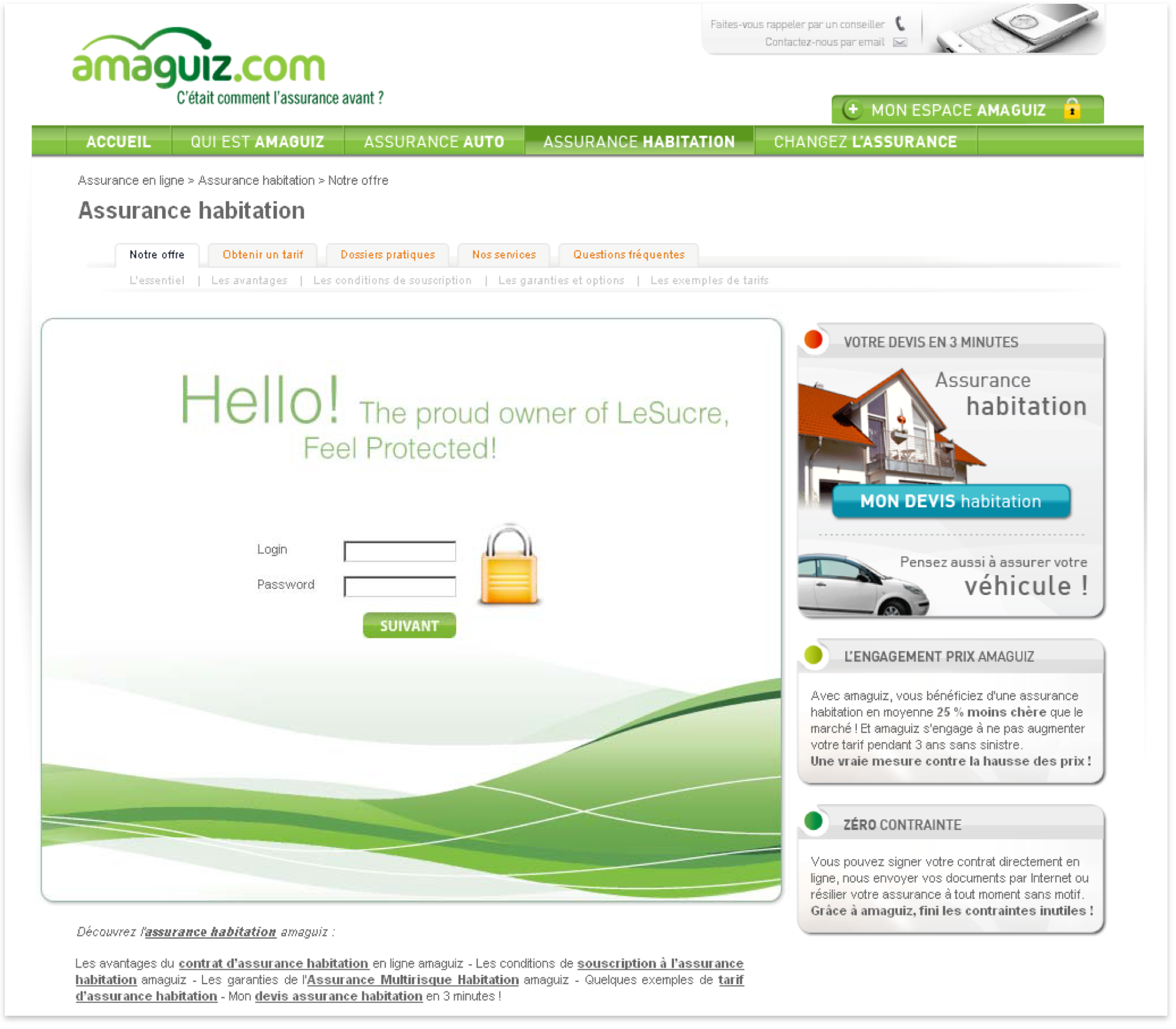
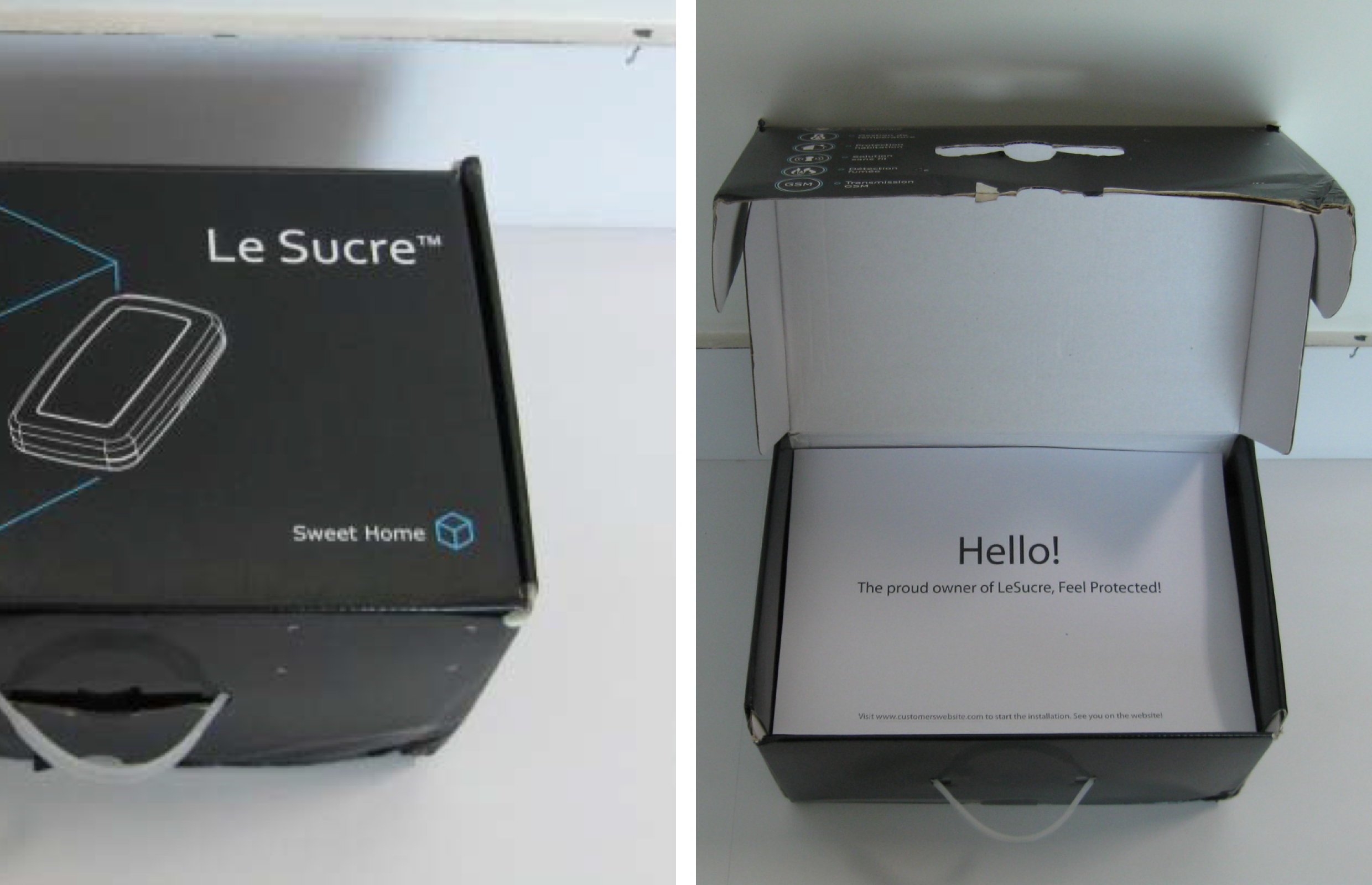
Welcome message when the user opens the box
A. Showing a welcome message on opening the box Delights the user.
B. Installation website URL shown as this is the First step in installing the device
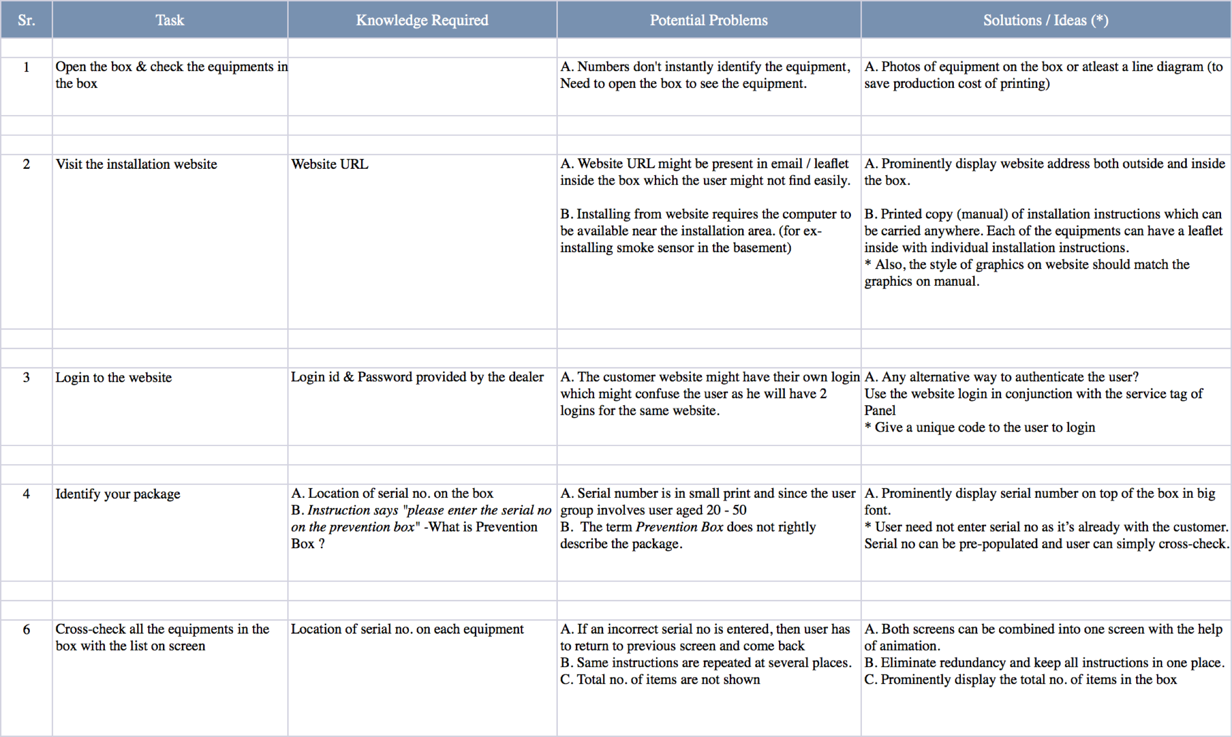
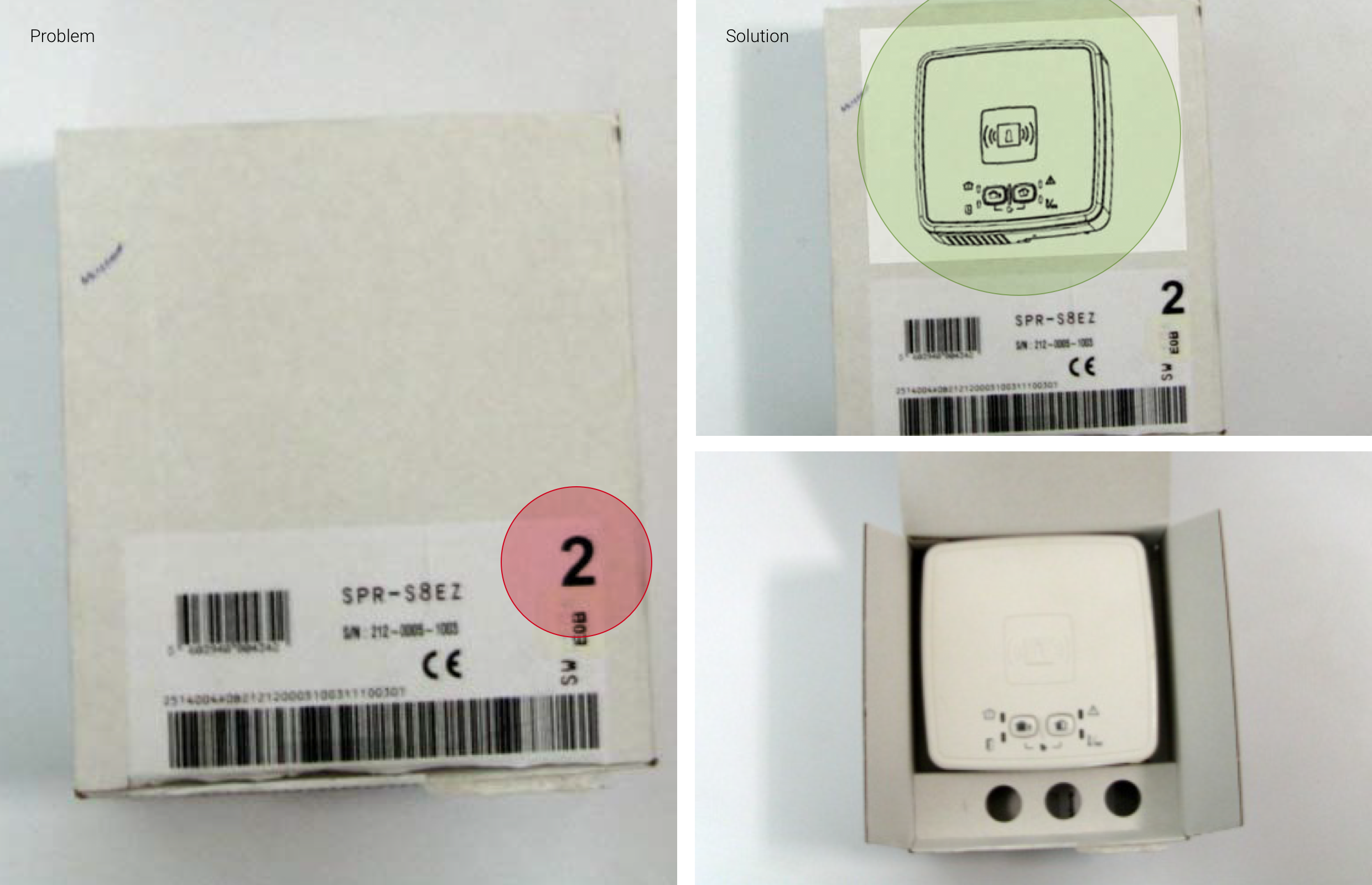
Opening the box & checking the equipments
Customer need to open the box to see the equipment as numbers don't instantly identify the equipment.
Photos of equipment on the box (or a line diagram) will help easily identify the equipment inside.
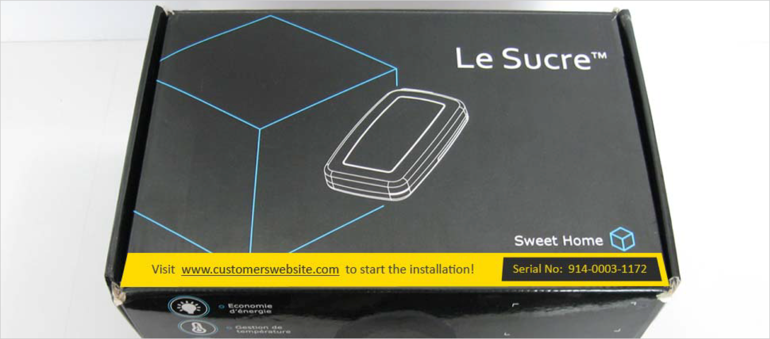
Visit the installation website
User has to look for the website URL in email sent by customer. This will increase the total time taken in installing the product.
Installation Website URL should be prominent as this is the First step in installing the device.
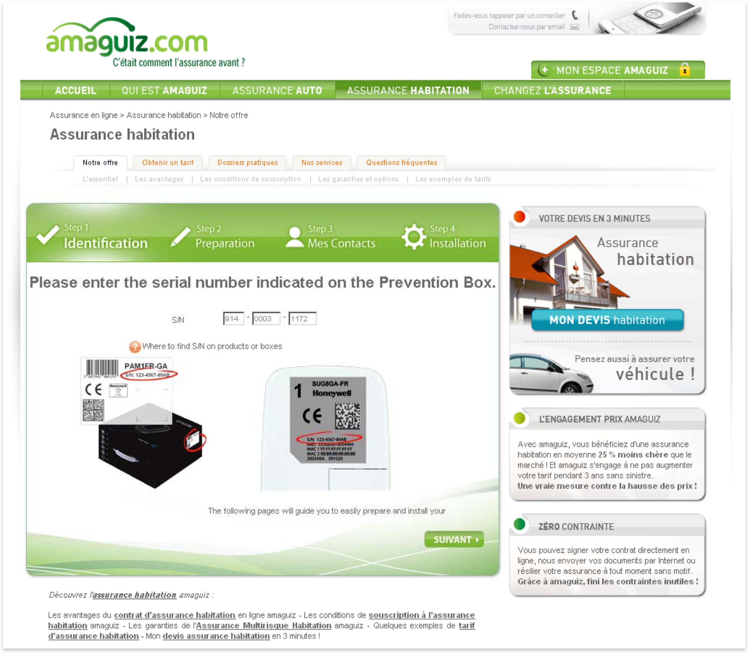
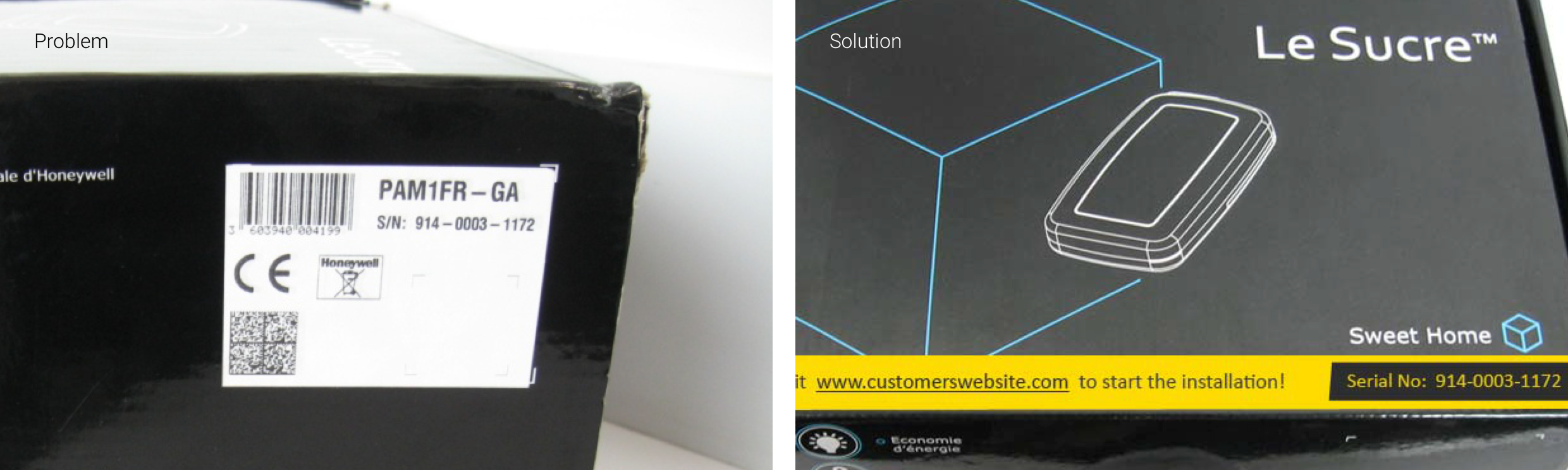
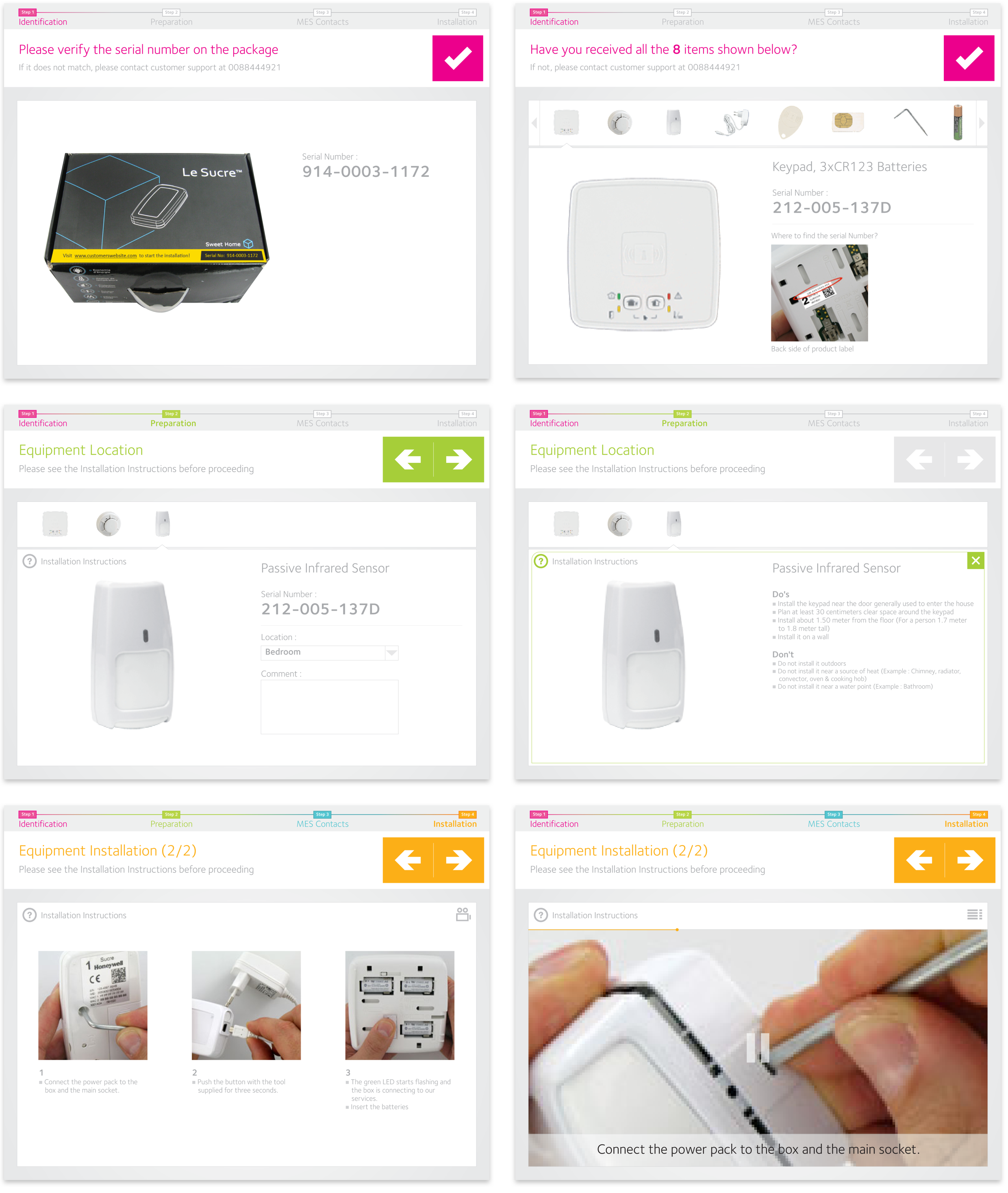
Serial number - location & font size
Multiple logins may confuse the user. The customers website may have their own login which the user might confuse with the installation login.
Alternative way of authentication can be using a Unique Code provided by the customer.
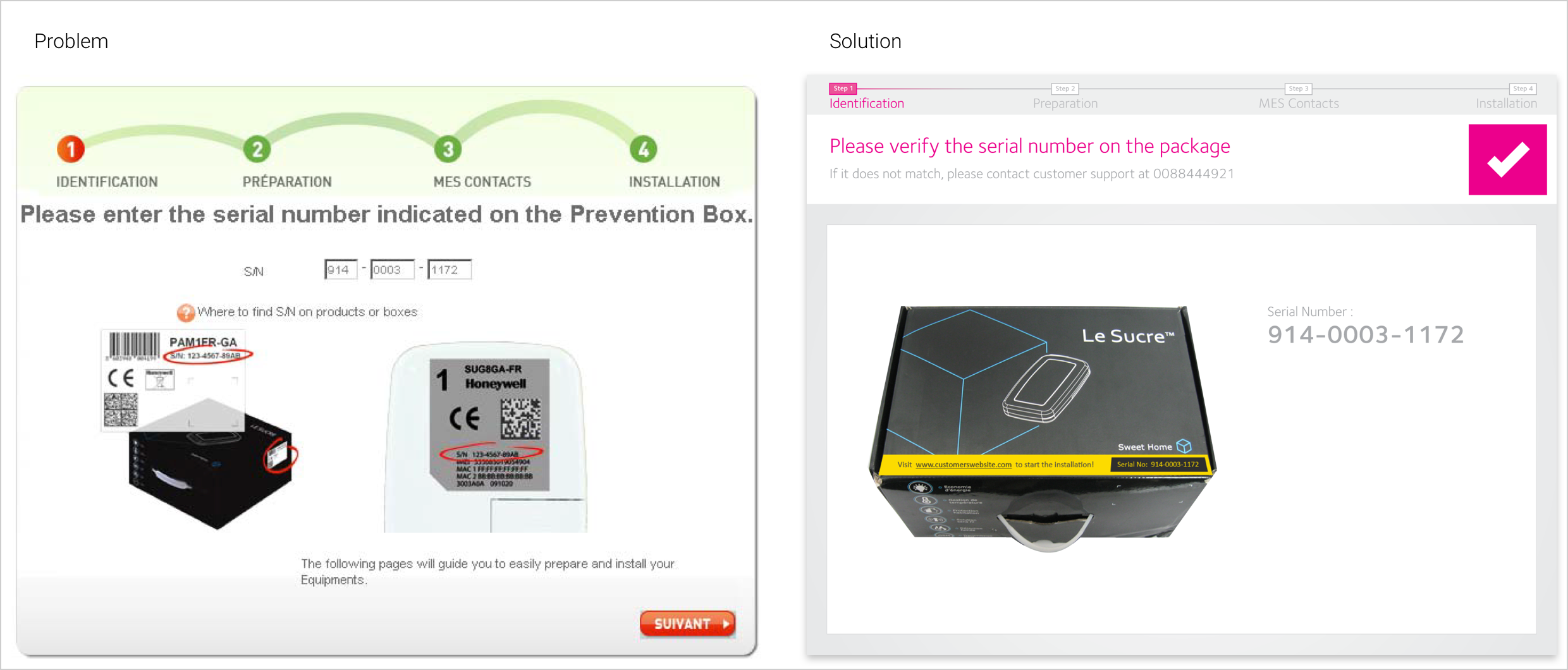
Identification - Enter Serial number
No need to enter serial no as it’s already with the customer.
Serial no can be pre‐populated and user can simply verify the number. Customer support number can be provided in case of any difficulties
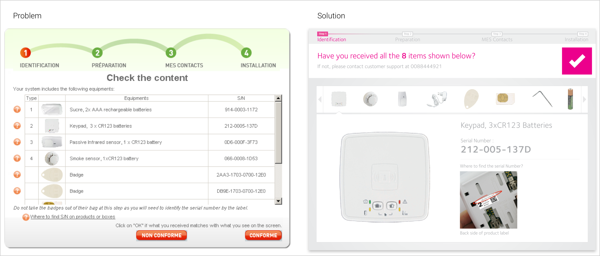
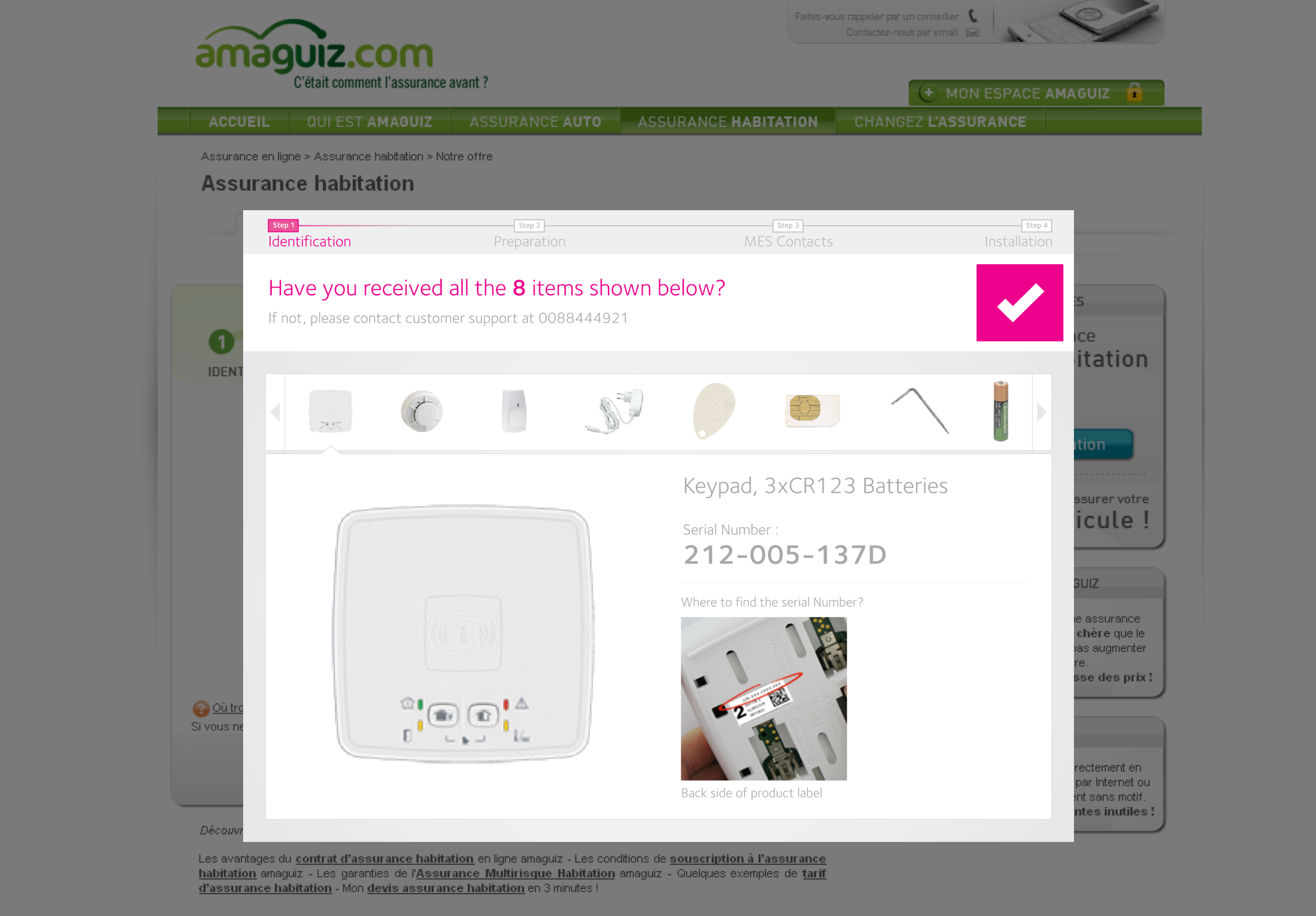
Identification ‐Checking the package content
A: Total no of items in the package are not shown.
B: To view help for each item, user has to click twice (for opening and closing the help)
C: Data in tabular format may overwhelm the user
D: ‘Type’ can be misunderstood as just an index. Also, if the no of ‘types’ increases, it may create confusion.
E: Redundant text ‐Similar instructions are spread all over the page.
F: No need of a button if the content of the box does not match the list
A: Total no of items in the package are prominently displayed.
B: Only one item is shown at a time, thus reducing the cognitive load on user.
E: Instructions are combined such that it’s easy to understand.
F: User can confirm if the items match. Else, he can contact support.
C: Help is always visible
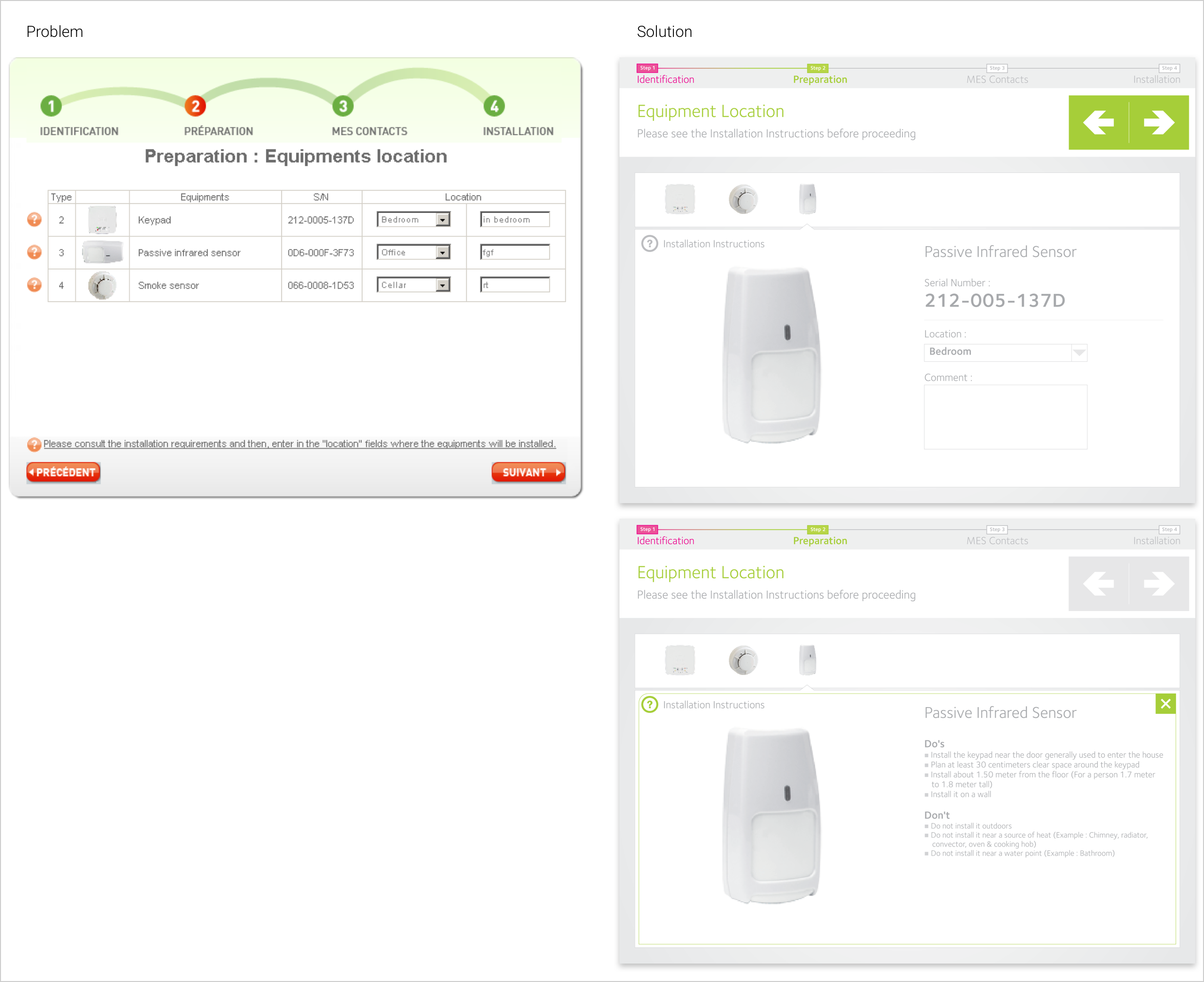
Preparation ‐ Enter Location of equipments
A: The purpose of text‐box is not clear.
B: Instruction is long & confusing.
C: ‘Installation Requirements’ is shown in a popup with ‘next’ button. This may divert the user from the actual task.
D:The term ‘Installation Requirements’ is not clear
A: Text‐box title added.
B: Instruction is short & to‐the‐point.
C: Installation Instructions can open on the same panel using animation. Also the next‐previous navigation is disabled when the panel is opened.
D: The term ‘Installation Requirements’ has been changed to ‘Installation Instructions’
Installation instructions - Video
A: Use videos to communicate the installation instructions efficiently.
B: Video with voice, subtitles & player controls (pause, play, progress bar)
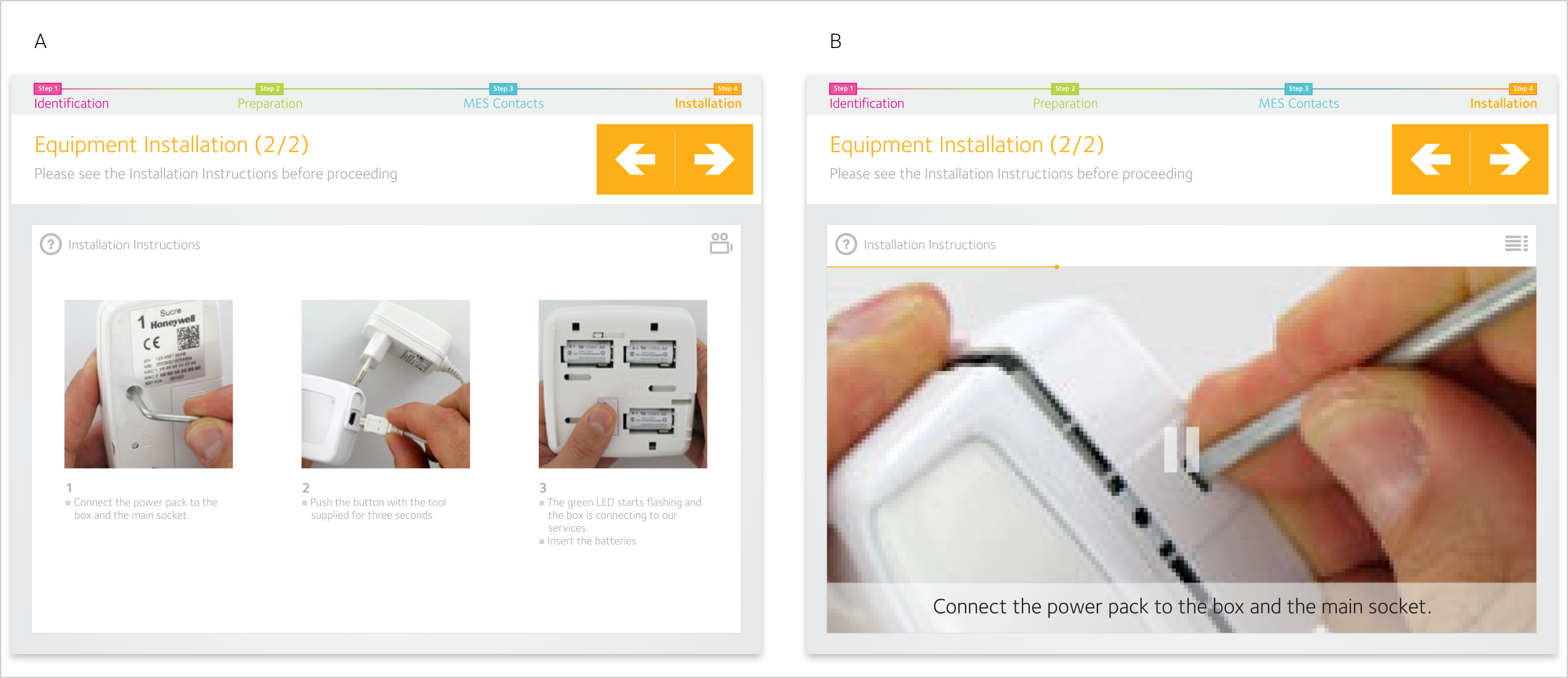
Full Screen mode
A: Full screen mode will help in preventing the user from diverting from the installation process.
B: It will also help in creating a color scheme which is independent of the customer’s website)
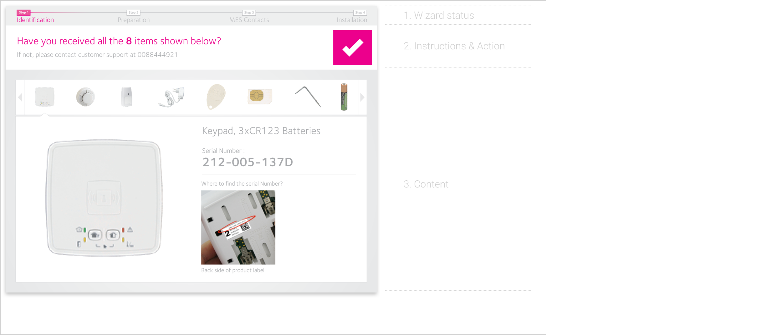
Layout Framework & Visual Language
A: Screen is divided into 3 sections: 1. Wizard status, 2. Instructions & Action, 3.Content.
B: Using visuals (for navigation) will eliminate the need to make images with text (in different languages)
All Redesigned Screens
Approach 2
Minimal improvement in user experience by replacing the existing graphics like the top banner, buttons etc and not the existing workflow and interactions